CARNET
We designed an e-learning platform for the Croatian Academic and Research Network
While this project was started during pre-COVID-19 years, it really shined in 2020 when Croatian school kids had mostly online lectures.
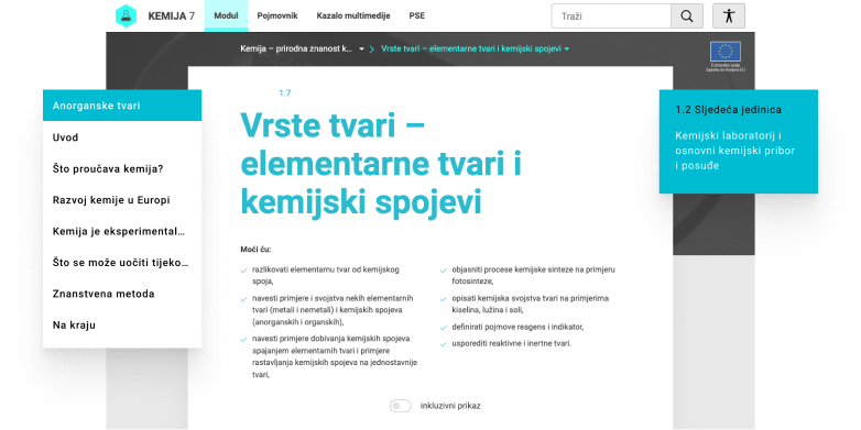
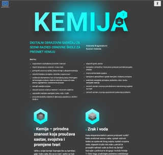
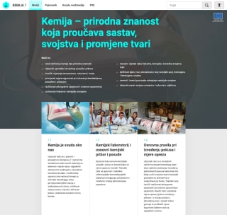
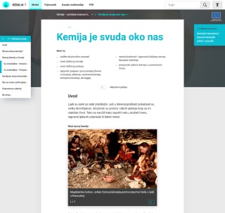
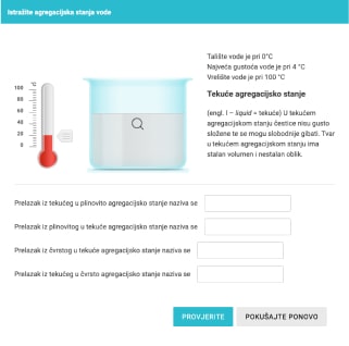
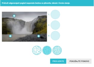
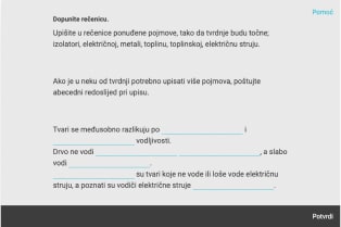
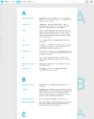
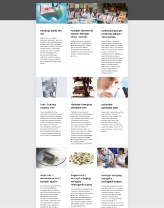
We worked on designing and developing digital education content for Chemistry and Biology. Project involved cooperation with dozens of experts from various fields of work.
- strategy
- usability research
- UX and UI design
- development
Chemistry
Install apps to your mobile devices.
Biology
Install apps to your mobile devices.
Android
About the client
CARNET was established in 1991 as a project of the Ministry of Science and Technology in Croatia. It is the national research and education network of Croatia, and it’s funded by the government budget. CARNET operates from offices in Zagreb and five other cities.
CARNET’s activities can be divided into three primary areas: Internet service provision, encouragement of information society development, and education for the new era.
1991
The year CARNET was established
140+
Employees
1650
Educational institutions connected through CARNET
70+
Service offers
About the project
The project is a part of the “E-Škole” initiative aimed at establishing a digital network of elementary schools and high schools throughout the Republic of Croatia.
We worked on designing and developing digital education content for Chemistry and Biology. Project involved cooperation with dozens of experts from various fields of work.
Project goals
Big and impactful projects, like this one, come with a lot of challenges and ambitious goals.
We worked on designing and developing digital education content for Chemistry and Biology. Project involved cooperation with dozens of experts from various fields of work.
Funded by the EU
The project was funded by the European Union, and the total budget for the project was 41,000,000€.
All shapes and sizes
Digital education content needed to be completely responsive and scalable. The desktop resolution, tablet resolution, mobile resolution, online or offline, we needed to cover everything.
Digital revolution
Connecting educational institutions in Croatia through digital medium was the primary goal of the project. The pilot project involved middle schools and high schools.
Learning from interactions
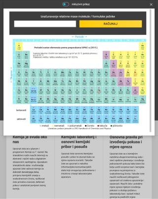
Digital media opened up new learning possibilities. The first one is video materials and interactions that should further increase student interest in the subject.
Design decisions
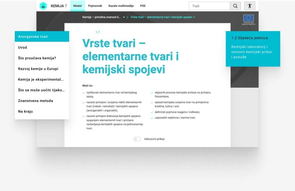
The design needed to follow accessibility rules and practices, but it also needed to be modern and welcoming.
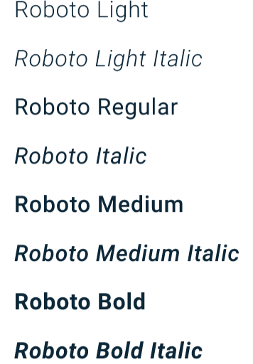
Typeface choice
Chosen font had to tick a lot of boxes. Readability is a major one, the font had to cover various resolutions and devices. Additionally, it had to cover extended Latin letters as well as Greek letters because of mathematical equations. Ultimately, we chose Roboto.
Spacious design
Wide margins around the content create a visual hierarchy that directs the eye towards the center. This is important to capture and keep the focus of the students on the learning material.

Strong colors with good contrast
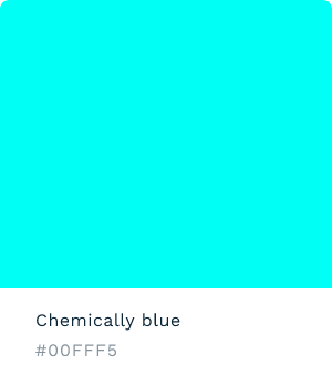
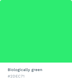
Bright colors were used throughout the project. Cyan color was used as a primary color for chemistry, and bright green was used as a primary color for biology. They needed to capture attention on both light and dark backgrounds.
Development decisions
Specific content requirements of the project informed the selection of suitable tools for development.
Languages and frameworks
Vue.js was used to create all of the interactions on the project since it offers a lot of functionality in a simple package. Mathjax and Mathlab javascript plugins were used for mathematical equations.
Distribution process
We created a build process that prepared educational content for every platform. The exported content is uploaded to the repository, thus being readily available to the end-users.
Accessibility features
Accessibility was the absolute imperative of the project, and we delivered.
Letter-size, dyslexia-friendly font, contrast, and more
There are many accessibility features woven into the app. Content is made with screen readers and other assistive technologies in mind. Every video comes with built-in subtitles (closed captioning). Going further, we provided an option for font size, enhanced contrast, and a night theme.
Additionally, there is an option for enabling dyslexia-friendly font, that should help students with reading difficulties.
Results
Clicks don’t lie. We aim for metrics that can confirm our work and guide future efforts.
35 000
Students are using digital education content
7 000
Teachers involved
150
Schools are in the pilot project
Services utilized
Web development
- frontend development
- backend development
- accessibility
- user research and testing
Website strategy
- client workshop
- research
- platform architecture
UX & UI design
- information architecture
- user experience
- prototyping
- UI design
Quality assurance
- performance testing
- functionality testing
Like what you see here?
