Design trends and cycles in UI/UX, the history of art, and typography
Let’s explore design trends in UI/UX design, the history of art, and typography in our in-depth post covering millennia of human creativity by our Lead Designer, Hrvoje.

Introduction
Have you ever noticed how things repeat themselves? As Nick Cave suggests in his renowned book, “The Sick Bag Song,” “Everything is happening, has happened, and will happen again. Everything that exists has always existed and will continue to exist.” Now, let’s apply this thesis to design. Consider colors, for instance. In cave art, people utilized the colors available to them — black (from charcoal, soot, or manganese oxide), yellow ochre (from limonite), red ochre (from haematite, or baked limonite), and white (from kaolin clay, burnt shells, calcite, powdered gypsum, or powdered calcium carbonate).
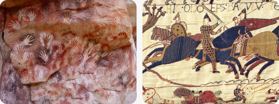
Right: A scene from the Bayeux Tapestry depicting Odo, Bishop of Bayeux, rallying Duke William’s troops during the Battle of Hastings — the Middle Ages, 1066
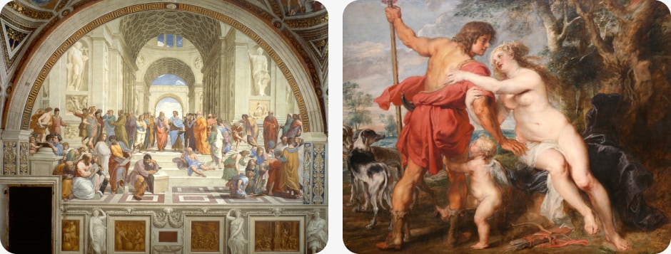
Right: Venus and Adonis by Peter Paul Rubens — Baroque, 1635
As knowledge grew, people invented ways to create new colors and used them to set themselves apart from their predecessors, create variety, and improve. As time passed, new fashions emerged. Colors and styles replaced each other.
From dark tones to colorful variations, then back to dark monochromatic styles, and again to fresh color schemes. At first glance, every change feels new and exciting, but if you take a few steps back and view it from a distance, you’ll begin to notice that things repeat. Sometimes this is a result of a discovery, sometimes due to a simple need for change, or sometimes to evoke a feeling or idea from the past.
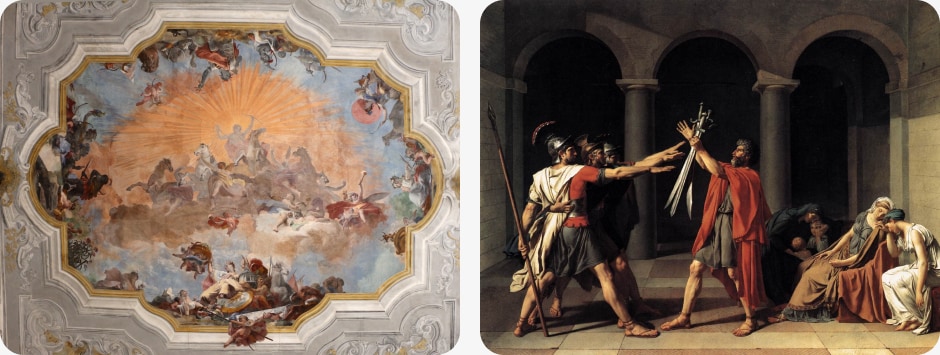
Right: Oath of the Horatii by Jacques-Louis David — Classicism, 1784
Look at art history. After the Middle Ages and the plague, there was a new spring in culture — the Renaissance. It opened new horizons in almost every field, including art and the sciences.
After the Renaissance came the more intricate Baroque, which peaked with Rococo’s over-the-top embellishments. That bubble had to burst, and it was followed by the much more somber Classicism. With the rise of industrialization in the second half of the 19th century, the Arts and Crafts Movement began in England, culminating in Art Nouveau.
When people were fed up with all the embellishments, the style changed to Dadaism and other art movements coexisting at the same time — all of these are collectively called modern art — and the whole process started again.
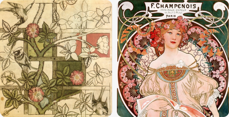
Right: F. Champenois Imprimeur-Éditeur by Alfons Mucha — Art Nouveau, 1897
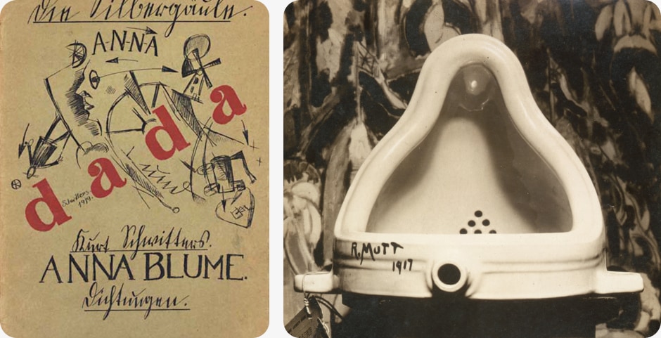
Right: Fountain by Marcel Duchamp — Dadaism, 1917
In this article, I will summarize what I have noticed in the last twenty years of working as a designer and art history student. Since this is just a relatively brief overview, a lot of it will be general observations, but still, I hope it will appropriately cover the subject that interests me.
Typography
Let’s take a look at historical typography references; most of them were created by artists. These artists either followed the styles of their times or boldly swam against the current. Yet, we can identify a typography theme for almost every period in history.
Let’s start with the Romans, a civilization that tried to put everything in order. During their reign, when they controlled territory from Lusitania (today’s Portugal) in the west to the Caspian Sea in the east, and from Britannia (today’s England) in the north to Aegyptus (today’s Egypt) in the south, the Roman Empire was a cultural melting pot. They assimilated all the cultures they conquered and incorporated them into their own. They brought technical advances to every corner of the occupied land. Among all the marvels, there were also the strict, geometrical Roman Capital letters.
These letters were primarily chiseled in marble that covered their buildings. These letters have a strict center line used as a guide for chiseling the letter shapes. Since the same center line was depicted when sewing the letters onto banners, we can clearly define this as the typographic style of the time.
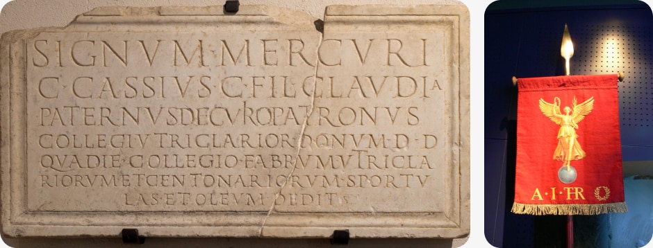
Right: Modern reproduction of a Roman cavalry vexillum, license
As we learn from history, the Western Roman Empire was defeated by Germanic tribes, including the Visigoths and Ostrogoths, who were illiterate or used runic symbols. These were in stark contrast to the strict Roman style.
Here, we can’t claim that runes were a new style adopted by the masses because of stylistic traits or trends. It was simply that one was literally overrun by the other.
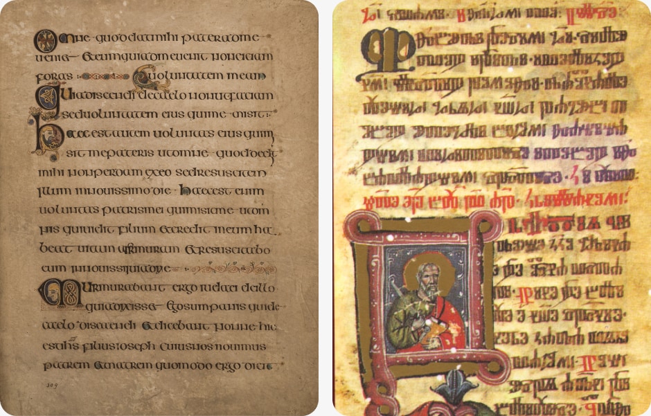
As the new world progressed into the Middle Ages — cultures were mixing, and some Roman details were absorbed — Latin reinforced its role as a language of culture and science. Since Latin originates from the Romans, it was also written in Latin script. These letters have since evolved to incorporate lowercase letters with capitals — lowercase letters were added to the capitals. This new version of typography is called the Uncial script. It was still written only by a few — scholars, scribes, clergy — since the majority of the population was illiterate. But now, the texts have evolved from just carrying a message to being beautiful works of art. Artists were given the task of drawing small illustrations and capital letters in the form of modern-day drop caps to further enrich the texts. Books truly became treasures.
Let’s jump a few centuries to around 1450 when Johannes Gutenberg introduced the metal movable-type printing press in Europe with improved type casting. These first printed books were called incunables — an anglicized form of incunabulum, “swaddling clothes,” or “cradle”; from the late 17th century the term incunabula refers to printed books. To accompany new publications, some new features needed to be invented. For instance, ink traps, ligatures, and various spaces. The purpose of ink traps was to utilize excess ink and still keep the letters readable — letters were designed to be thinner or have small pockets at certain places where excess ink could flow without fear of damaging the legibility of the letter form.
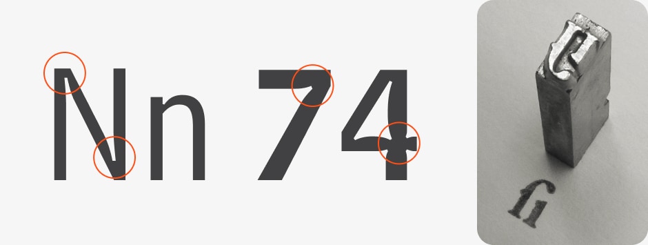
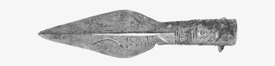
Right: A piece of cast metal type ligature of letters f and i, Garamond typeface, license
Ligatures are single letterforms that combine multiple letters. These are utilized in typefaces where there are problems with the spaces between the letterforms. For instance, with letters f and i, where f’s terminal collides with i’s dot, a ligature commonly known as fi solves this problem. Other common ligatures are used to replace, for instance, letter combinations such are ff, ffi, fl, and Th.

The letter shape “&” is also a ligature, combining letters E and T. It came from the Latin et, meaning “and.” The use of these kinds of letterforms in modern digital design is a trend that aims to invoke handcrafted shapes.
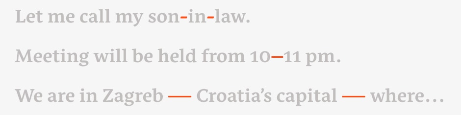
Spaces of various widths were created to make row justification possible — if there is a gap after the last word, simply increase the spaces in the row to compensate for it and fill the row width. This was also facilitated by the implementation of hyphenation, which has been in use since the 10th century.
Initial letters were simple with small serifs and features, but artists soon caught up with them and created more elaborate and intricate designs. And finally, we can talk about modern typography styles. From this point on, all modern typographic expressions evolved, such as leading and kerning. Leading is the vertical space between baselines — line height — of text rows, and kerning is the process of adjusting the space between two characters. Its origin is from lead strips that were wedged between set lines of lead type to increase the distance between rows — that’s why it’s pronounced led-ing and not leed-ing. Kerning, from the French word carne, means “projecting angle, quill of a pen”. Typesetters were kerning characters by inserting thin strips of lead foil to increase the distance between a pair of them to achieve an even flow of the word. These pairs of characters are then called kerning pairs.
Fun fact: keming. /’kɝmɪŋ/. n. The result of improper kerning.
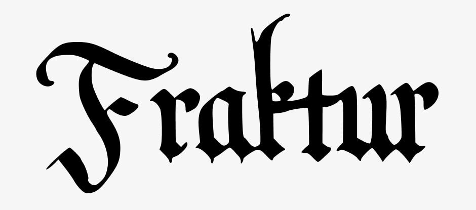
As time passed, the letterforms evolved. Many other styles emerged. Some were written by hand, and some were printed. In the 16th century, one of those was Fraktur — a reimagined medieval blackletter script but with a contemporary twist. It has high contrast in the width of its curves — writing with horizontally cut feathers or reeds produces thin horizontals and thick verticals.
After the stricter style of Neoclassicism (interest in Roman style was invigorated by the rediscovery of Pompei and Herculaneum), and more ornate Romanticism, it all built up to the peak of ornamentation in Art Nouveau — as you can remember from the introduction.
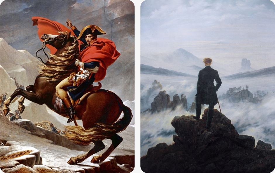
Right: Wanderer above the Sea of Fog by Caspar David Friedrich — Romanticism, 1818
People turned to nature, to its natural flows and curves. Floral shapes were everywhere. Everything was colorful and vivid, light and happy — it lost all the classical monumentalism and stern strictness. Of course, these shapes and elements were also influencing typographic designs. Designs were flowing with freedom, almost at a whim.
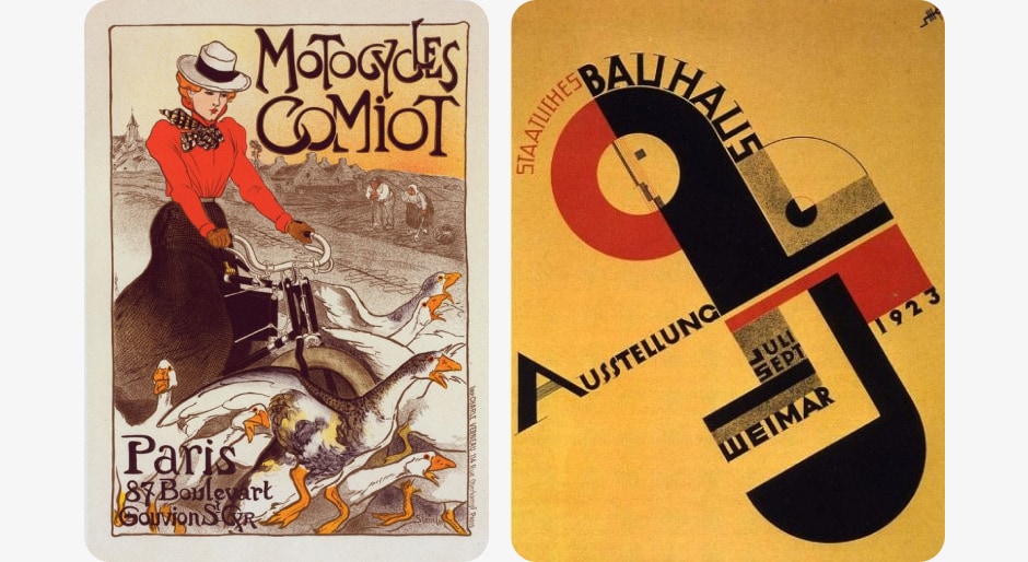
Right: Poster for the Bauhausaustellung, by Joost Schmidt — Bauhaus, 1923
Soon, everything was over-the-top. And with that, it was time for a reaction. It came in the person of Walter Gropius, a German-American architect, and in the form of The Staatliches Bauhaus (1919 – 1933) — known simply as Bauhaus — an architecture and design school founded by Gropius. To contrast the previous style, Bauhaus promoted simplicity and advocated for the form-follows-function norm by architect Louis Sullivan. Influenced by architecture and modernistic apostolates, sans-serif letters emerged, cleaner and even more geometric than in previous instances. The school moved twice, from Weimar to Dessau, then from Dessau to Berlin.
With the rise of German nationalistic tendencies, the school was considered a center of communist intellectualism by the conservative fascist party and its members. Thus, Ludwig Mies van der Rohe, its director at the time, had to close it down. German nationalism, turning to fascism with Adolf Hitler at its front, needed something different, something that was presenting the German nation’s roots and longevity. They wanted to present the German people as Übermensch, as the supreme race. To achieve that, they designed the whole movement. Specifically, Hitler himself turned to Richard Wagner’s compositions in music. The Nazis basically took and glorified parts that suited them and ignored the rest. This gave them an audio base, but for visuals, they turned to designers and architects. Namely, Hugo Boss, Cristobal Balenciaga, Louis Vuitton, and Albert Speer, who was the main architect of prominent buildings during the Third Reich — don’t confuse him with architect Albert Speer born in 1934, Speer senior’s son with the same name.
The Swastika and the Nazi flag were designed by Hitler himself. Obviously, visuals were pretty important to the movement. And with all this, they needed typography to round it all up. That’s when the neogothic Fraktur was brought back. It spread with the German war advances. In 1941, the Nazi party forbade its use because of the discovery of Jewish involvement in the design of the letterforms.
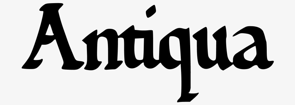
It was replaced with the Antiqua alphabet, which was Roman, and everything that could connect the Nazi’s expansive tendencies with the Roman empire was considered a good thing.
While the Nazis were looking for historic proof of their supremacy with handwritten serifed letters, the Soviets, and the Francoists were trying to establish themselves as a modern and progressive option with sans-serif letterforms. All three letterforms were monumental and bold.
After the war, in countries not under the communist regime, a change in the air was needed so more gentle typographies were used. Thinner letters with smaller serifs.
This all changed in the sixties when the hippie subculture emerged with all their return to the Earth and Mother Nature philosophies — does anyone remember Art Nouveau? Yes, similar principles are present with the hippie movement — it was all back to curls, colors, and natural flows.
After this, everything sped up. Styles changed almost from season to season. People became bored with simplicity and geometry and they turned to more vivid typefaces, which were then replaced by serifs, which were replaced again with sans serifs, which reached their maximum in simple geometric typefaces.
Soon, people wanted something different and we were back with the “hippie” phase, as I like to call it, then serif and round, and round it goes. Do you see the pattern? It’s easy to follow. But why is that? Do we have shorter attention spans than our ancestors? Are we more exposed through various mediums? Maybe there are more choices to choose from. I believe that the answer is not simple, it is a combination of premises.
First of all, I believe that marketing is a prime driving force for these rapid changes. But the cause is ourselves, humans. We constantly expect change and innovation from our beloved brands. Our attention spans are indeed shorter. As a result of that, players in the market compete among themselves but also copy from one another if one nails some new visual cue that resonated with the consumers. The best thing is that the general public sees every change as something completely new, but only the keen eye will see the repetition wrapped in something flashy. There is an additional aspect to this. Our screens are getting better and better. Yes, we can finally see all the small details of the beautiful typography. Designers celebrated that with the implementation of hairline serifs, but soon more elaborate typefaces replaced them in all their glory.
As it has already been proved many times before and will be proved countless times in the future, people are always searching for change and for something new — maybe not completely new, but something that evolved from the past with new and invigorating traits. Or simply put, they add a new flavor to an already familiar feat.
Interfaces
Do you follow any web awards websites? I do — awwwards.com to name the most prominent one. Have you noticed that all websites look similar? Seven or eight years ago, almost everywhere you looked there was Futura or similar geometric typographies used for headlines and Proxima Nova for text — oh, how I disliked Proxima because of its lowercase letter a.
Everyone used the same primary combination of colors: red, white, and black. This was soon replaced with gentle serifs and more pastel colors. Then brutalism, or as I like to call it, fake punk, took over.
A year or two ago, all the rage was quirky, art-nouveau-like typographies with jumping images on hover, and pastel and earthy colors. This was replaced with sans-serif typefaces, some messages written in circles and rotating, with much bolder and more screaming colors.
Have you noticed a pattern yet? Every style lasts for about two years, when it changes rapidly into something almost opposite. And again, after some time, it repeats itself.
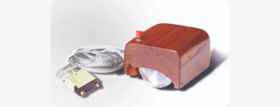
But let’s look at it from a historical point of view. Long before Apple Macintosh’s GUI was presented in 1984, in the 1960s there was a man called Douglas Englebart. On December 9, 1968, Englebart presented NLS, the oN-Line System — a complete hardware and software system. That was the first time many essential parts of today’s computer were presented all in one system.
Englebart presented windows, hypertexts, graphics, efficient navigation, and command input, video conferencing, the computer mouse, word processing, dynamic file linking, revision control, and a collaborative real-time editor. And all that in 1968, Wow! That must have been a highly inspirational and exciting event. Today, that demonstration is fondly known as The Mother of All Demos. While it was completely groundbreaking, it was just too soon for people to adopt it. In 1973, Xerox presented its mouse-controlled Alto operating system with a GUI based on Englebart’s NLS. That was the prime influence on Apple’s Macintosh and later on Microsoft’s Windows.
Let us now focus on GUI. As mentioned in the previous paragraph, a new paradigm was invented to guide its new users and teach them how to use it. The easiest way to achieve this was by using icons that look like everyday objects we are all familiar with — objects like folders, documents, paintings, and alphabet letters.
This paradigm is called WIMP, short for windows, icons, menus, and pointer. And thus skeuomorphism was born — from the Greek words skeuos (σκεῦος), meaning “container or tool”, and morphḗ (μορφή), meaning “shape”. It wasn’t as polished as some later instances — we’ll get to those — but it was groundbreaking nonetheless. Imagine that it’s the year 1968, and you are at a computer presentation, and someone demonstrates to you this incredible graphical user interface.
Suddenly, you didn’t have to be an engineer to use it, since everything was clearly understandable from simple icons.
Microsoft soon applied the same principles to its Windows system and the graphical user interface became the norm. Of course, the novelty wasn’t an instant worldwide success. The majority of households just weren’t in need of a computer, but as computers got better, the programs also evolved, so when Macintosh Lisa and Windows 3 came to market, the world was ready.
Operating systems evolved from version to version. Graphics improved with the technology — screens, the internet — but basically, nothing major changed from the paradigm point of view. And like in the previous chapter, we can observe this as a progression of design.
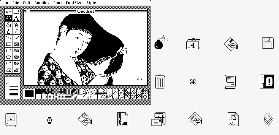
When the GUI was introduced, it was new. It needed something recognizable to help users get their bearings and help them achieve their tasks. That’s why icons represent objects from the real world. The first icons were simple black-and-white illustrations, but soon they got more elaborate. Icons for the 1984 Macintosh were designed by American designer Susan Kare. Among her epic icons was also the famous “Clarus the dogcow”.

Eventually, color screens came into wide use, so the GUI followed suit. Better graphic cards enabled richer gradients, transparencies, and shadows.
So, from simple to rich in a few decades. And then in 2007, Apple introduced its new flagship product. The first iPhone. Skeuomorphism culminated with the iPhone. There were leathery icons, a felt background, and sewn borderlines. Wonderful craziness. And it soon went overboard. It was too much. So in 2014, the style changed to minimal. Apple did it with its completely redesigned iPhone OS and accompanying typography, San Francisco, while Google introduced its Material design and its principles, while using the Roboto type family — designed in 2011 by Christian Robertson.
Bottom: Google’s Roboto typeface
It’s not only that people had had enough of the previous style. It was also the time for a change since people had learned how to use these devices, so the literal representation of physical objects wasn’t needed anymore.
Since then, interfaces have gone through various small changes but have followed the same principles. Today, skeuomorphism is slowly coming back in various styles like neumorphism and glassmorphism. It started as a visual trend of building faux 3D interfaces that quickly died away because people soon became fed up with it as it was almost omnipresent.
But what’s even more important than that, it wasn’t executed with accessibility in mind — contrasts were pretty low making readability bad or even impossible. The basic principle of it stayed — use simple interfaces and shapes but introduce subtle 3D effects like shadows and light hierarchy/light-dark perspective to achieve a multidimensional space, and thus achieve a layered interface similar to familiar spaces in our surroundings like tables and workbenches.
This approach is not as literal as skeuomorphism but is less minimal. It is somehow more human. We, humans, aren’t minimal beings. We accumulate things, feelings, knowledge, and experiences. Some way of showing emotions is always a good thing.
Right: Glassmorphism
Conclusion
It’s important to discern whether something represents progression or change caused by a historical event, and when change is invoked merely for its own sake.
Today, we witness the world changing rapidly; trends shift with the seasons. This is due to emerging technologies, but it’s also demanded by marketing teams trying to sell something new and exciting, and by people’s constant need for reinvention. Our lives are fast-paced and so is our expectation of change.
When Apple updated its flagship product, the iPhone (they intentionally kept the same design principle for a few versions and just changed details), the design of the actual phone was the same or very similar to the previous version. People reacted with dissatisfaction, even mockery. Yes, the new phone performed better, but it looked the same. If you want the audience to perceive something as new, updated, or better, it also has to look different from the version it succeeds. That’s just how it is.
I’ll be bold and venture into predicting that we are approaching another peak in decoration which will soon be replaced with yet another geometric phase. Let’s welcome this future for what it is, celebrate all the shoulders it stands upon, explore it to the core, and try to figure out what it will evolve into.
At Point Jupiter, we observe these changes and strive to design products that will stand the test of time.
Achieving something evergreen — something with a lasting appeal that always feels fresh and up to date — is tremendously hard. Of course, we observe the current trend but try not to blindly follow it. It’s better to combine it with the eternal truths — color theory, typography, history of art, psychology — and try to figure out what the next global direction will be and drive your project toward it or even try and surpass it.
Always aim to answer the key questions “Who is this interface for?”, “What is its function?”, and “What UX principles apply to it?” And remember that form always follows function; just give it a little human twist. Make it interesting. Don’t be repetitive. With every project, create something new. If project after project looks the same, you’re not progressing. You’re stagnating. Don’t get me wrong, I’m not claiming that every project should be groundbreaking and different from its predecessor. Small steps are still steps in the right direction. Also, it doesn’t mean you must change your design approach on every project. There are other aspects that we constantly improve on — business, project management, visual communication, content creation, front-end development, animation, and back-end development.
Let’s chat
Or maybe you have a great idea for a product and want to make it a reality? If you are unsure what the best next steps you need to take to deliver user-friendly products, reach out to us to schedule a free consultation with our experts. We’ll guide you through the whole process.