How to build highest fidelity prototype. Ever.
Sometimes you need high fidelity in your prototypes. But in this case, we needed extremely high fidelity, and it included programming in R.
As a UX Designer, I work on various projects where different levels of fidelity are required when building a prototype. This is a story of taking the concept of “high fidelity” to an absolute extreme. And it was a fun ride worth sharing.
The project had finished in January 2020, but a lot of information is still protected by the NDA. I won’t be revealing any details about the company, but I will describe the process and the decisions that led us to build the most automated high fidelity prototype ever. So I will call the product High Fidelity (although that is obviously not the real name).
How it all started
When Point Jupiter joined the project, High Fidelity was just an idea that our client had. So we got to be there from day one. High Fidelity helps financial advisors recognize the risks in the markets and guides them to actions that should be taken to avoid those risks. Simple!
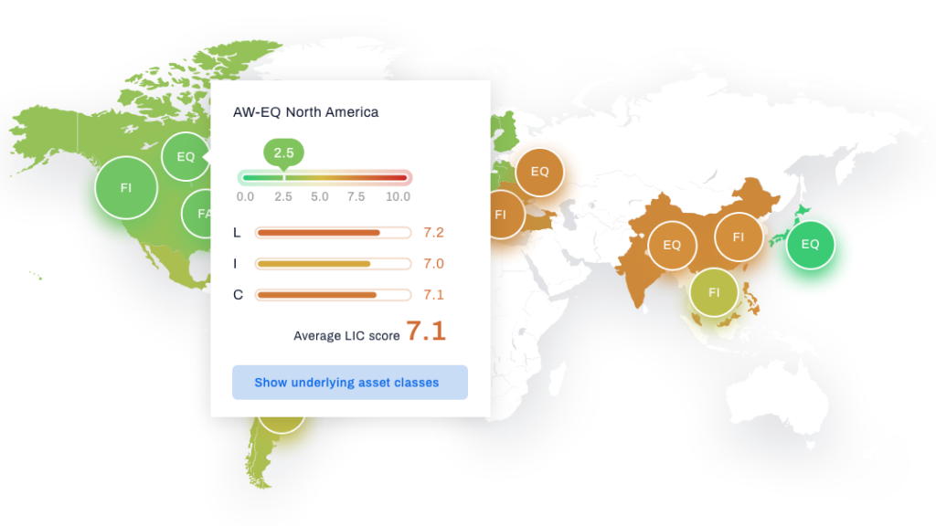
Obviously, it is a data-heavy product, and it relies on showing various charts, tables, heatmaps and whatnot to make sure the users understand what is out there.
Starting with “normal” levels of fidelity
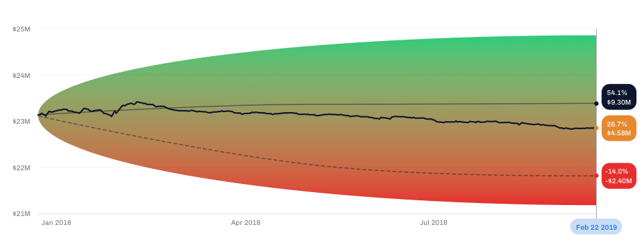
Usually, when I design a dashboard, and a dashboard is supposed to contain a chart that shows, say, how the value of the portfolio changed over time, I would just make an x-y chart and draw a zig-zag line, with an upward trend for better optics :).
But this product was different. The intended users are experts in the domain. And the client planned to regularly show the prototype to potential users to gather feedback. The users were supposed to evaluate how useful the actual information was to them, and that is almost impossible to tell from a mock chart.
So the client urged me to find a solution for this. I mean – the answer is obvious – let’s use the real data, but the question was how to do that effectively.
Introducing Larry and Ellen
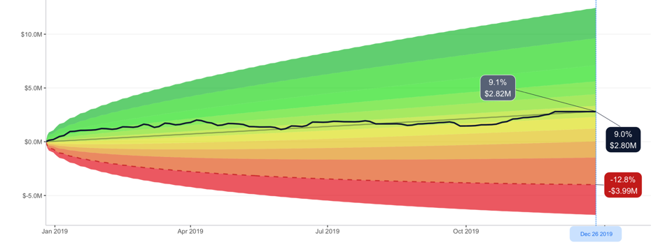
If we want to show real outputs, we need actual, real, inputs. So we constructed two personas: Larry and Ellen. Larry is the advisor, Ellen is his client. She has a portfolio and Larry is supposed to manage it until she retires. So we have constructed a portfolio for her. We found some ETFs (Exchange Traded Funds) that she holds in her portfolio, decided on the actual allocation and now we know what she has and how many shares of each asset she holds. We can now calculate the value of her portfolio each day.
But that’s easier said than done.
I initially thought I would do this in a spreadsheet (Google Sheets seemed like the right candidate). Still, luckily I gave up and remembered that I had, out of pure interest, taken some courses in R (a programming language for statistical computing and graphics) a few years ago and that could be useful here.
Introducing R
I have only finished two courses by this time, I’ve never before written a code in R that actually does something useful. And this felt like the perfect reason to sharpen my R skills. No time like the present. So I started exploring what R can do – and as I learned – it can do a lot.
The finance.yahoo.com is a source for learning the price of each of those assets in Ellen’s portfolio (e.g. QQQ). The service allows me to download a historic prices CSV (comma separated values) file, and the URL for the download has a logical pattern which lets me use R to easily download the prices for each ETF from a given date until today.
Then it’s just a matter of writing a relatively simple function that calculates the value of the portfolio from those prices and using the ggplot package produces a chart that can be used in the prototype instead of the mocked one.
A whole new world – highest fidelity prototype ever
The fact that I could do this opened an entirely unexpected world of possibilities for us, outside of just prototyping. I won’t go into too many details now, maybe in a separate blog post. Still, when we had realized the potential of introducing a data science tool, we started constructing and testing all kinds of mathematical concepts, methods, and tools that could take some input data and return valuable outputs. We were able to gather large quantities of data and do whatever we want with it.
This was a significant turning point in the whole process. Many of the features and mathematical constructs in High Fidelity today exist most likely only because we were able to check their real validity using the R language. Numerous ideas were discarded in the same way because they felt right in the beginning. Without actually going through the calculations, they would have felt right when mocked in a prototype, but only after actually applying math did we realize what tweaks and improvements are needed.
But I digress…
Using built-in automation in Sketch
After a few months, we are in a situation where the prototype keeps growing in size and the content is not mocked – it’s real, and it reflects what you would see in an app had the app been developed by then.
This is where using the Symbols in Sketch proved to be very, very important. The good thing about Symbols is that, for example, every instance of the same Symbol can contain a different image. You just have to select the specific instance, click the upload button and point to the exact image you want to show. This allowed me to design a chart once and use it across multiple pages, and yet, each instance shows a different image (because the user is interacting with the prototype and appears to be changing the underlying output).
Other than images, the Symbols can also hold containers for text, which is excellent for populating tables, for example. Well, at least if the layout of the text is vertical. It’s not great if it’s horizontal, which is also a case that we had when designing a heatmap; but that’s OK. Not everything has to be super simple 🙂
Regular updates required
We are now at a point where I can use R to download some files from the internet, fetch the data from those files, do some magic and produce images and CSV files which I can then use to go through my Sketch file and update the prototype.
However, the client was about to start doing regular demos and tests with potential users, and they pointed out something that the users might consider sub-optimal. They feared that, given the expertise that these users have and how their job requires them to monitor the markets constantly, if they are to evaluate the usefulness of a prototype and “today” in the said prototype is six weeks ago… that’s not good. The client said “prototype today” should be no more than a few days ago.
Which means that I would need to update the entire prototype every week.
Now it might be a good time to mention that the entire prototype had about 400 pages in InVision. Of course, not all of them needed updating, some were pop-up messages, others were not changed for any reason, but still – there were hundreds of charts, tables, heatmaps, small bits of information here and there… all of which is changed when new data is fed in.
It took me 6 to 8 hours to update all of them, and I would make dozens of mistakes (omitting something, for example). This was definitely not doable, and a new solution was required.
Abandoning built-in automation in Sketch… well, almost
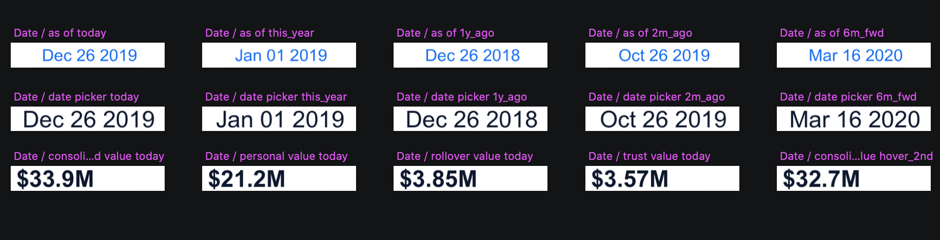
I had to identify what was time-consuming when updating the prototype. One obvious candidate is all those charts (images) that had to be uploaded into Symbols. But there was an even more devious culprit – text. More precisely – dozens of different values, numbers and phrases that had to be updated in all the tables, heatmaps and labels.
So I started exploring what R can do about this, and it turns out – it can do a lot with the annotations in the ggplot package. Essentially, it returns a string of numbers or characters and allows me to position it anywhere in the file content area before exporting the file as an image. Sometimes this annotation has to be placed relatively to some line in a chart, in other situations it has to be positioned absolutely (when it represents a table column, for example). In any case, ggplot can do it, with few tweaks 🙂
This was the moment when I had basically started constructing the prototype from scratch, but this time it was designed specifically for receiving the output from R.
How did I do it?
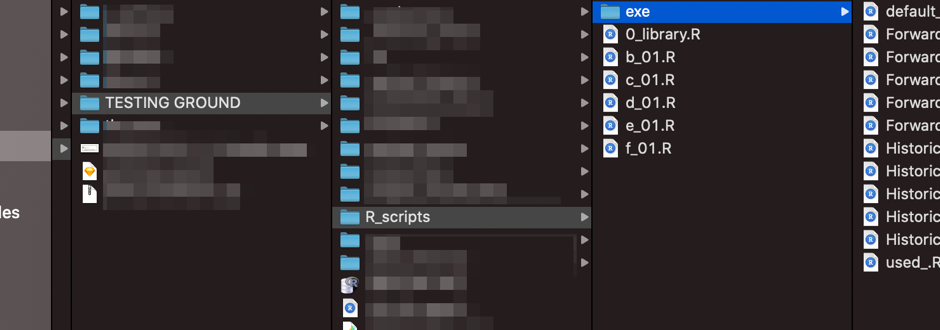
I have created a Library file for my sketch files, and all the Symbols were there, and a few of my sketch files were sharing the same library. I did this because I would have a lot of imported images per artboard, and my Sketch would be incredibly slow if I did everything in the same file.
Next, each piece of text on the screen that would change because of an update – must be converted into an image (in Sketch). Even if it’s just a single piece of information like date or dollar amount – if it’s variable and will be affected by the updates, it will be an image that R will produce and I will import into Sketch. Sometimes the same piece of information would be shared across many artboards, and in that case, I would import it in the Symbol in the Library, but if it’s a unique instance of it somewhere in a single artboard, then I wouldn’t bother with Symbols.
Charts, tables…
Charts will not be imported into the instances of Symbols (like I did before) because it requires me to manually click a button and find a file. Instead, the Symbol that represents the chart will have everything except the image, and the image will simply be imported directly onto the artboard.
Needless to say, all the tables and all the heatmaps are just images where I have programmed the exact position of every number and every character.

Although I could write a whole blog post about exactly how those R scripts are written (those that produce all those images and what kind of tricks I have implemented to make them more efficient and easier to use), I will skip that part and just focus on the aspect of Sketch. If we just take it as given that R will produce hundreds of images, the only question that remains is how am I going to upload them to my artboards.
Plugin to the rescue
Luckily, there is a plugin called Sketch Replace Images. The way it works is that if I upload an image with some unique file name in a sketch file, I can replace that image with something else. As long as the path remains the same (the directory and the file name), after I run that plugin, it will automatically update the image in the artboard with this new one. Perfect! That was precisely what I needed. All I had to make sure is that when R produces the images, they all have unique names. But that wasn’t hard. The artboard ID was unique anyway, and I would just add a few characters that indicate the type of information, and combine that with the ID of an artboard that it was supposed to go to – and we have a unique name.
PNGs galore
What I have now is a set of scripts in R which will produce hundreds of .png files and export them all to a single directory. Then I will have to upload them in their correct positions once, but after that, I just have to run the Sketch Replace Images plugin, and Sketch will automatically update them with new ones.
The next step
My entire manual work needed to update the full prototype was brought down to literally a few clicks of a mouse.
R and how to optimize our scripts
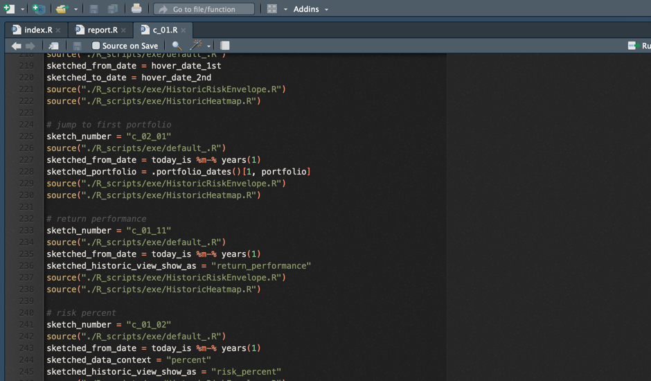
First, I would have to run the main R script, which would:
- Download the newest asset prices from finance.yahoo.com
- Execute (run) a bunch of different functions needed to calculate all the returns, performances, risks and whatnot that need to be calculated to get the numbers that we need
- Start sourcing the sketch scripts one by one to calculate everything and export the results in corresponding image files
It would take R more than three hours to go through all of this (the part that prints the charts is slow), but it’s the time during which I can work on something else.
When all the images are prepared, I just have to open my sketch files and run the Sketch Replace Plugin in all of them, wait a few seconds and then export the artboards to a directory.
After that, I have to import the files in the InVision project. And there, everything is already connected and runs like clockwork.
The highest fidelity prototype – it’s almost like an actual application
Now, not only that I could easily update the prototype every week, I could do it every day. And what you see on each screen would be real numbers, real charts, everything just like in the actual application. Nothing was fake.
A client, jokingly, said that they don’t even need to build the app anymore if they have this. Well, they did, of course, but it paints a picture of just how far we took the fidelity of the prototype to satisfy the specific needs that this client had.
In my 10 years in the UX industry, I’ve never worked on a project that needed that level of authenticity and genuine real-life truthfulness of all the information presented in a prototype. And I don’t know if I ever will.
A conclusion or when to consider building the highest fidelity prototype
What did I learn from this experience? Well, I learned a lot of R. Second, I never before had to plan the prototype through the use of Symbols as much as I did here. Symbols inside Symbols, Symbols carrying images, updating the images in the Library to update all the dates, amounts… This was by far the most structured, and arguably the most elaborate prototype I have ever made.
Would I recommend this approach? If you find yourself in this specific scenario like the one described above – sure. It’s probably the only way to deliver to the client what they need short of actually developing an app. But in most other cases it would likely be an overkill and a waste of time. I am currently working on two different projects, and those clients really don’t need their prototypes to be regularly updated with real-life data. Actually, most of the numbers and names displayed on the pages can be entirely made up (which felt a bit funny to do because for 18 months the mantra was true, real-life numbers only).
I don’t expect that many UX designers will be in need to continually keep their prototypes fresh and populated with real data. I didn’t believe I would ever find myself in that situation. But it happened, we reacted to it appropriately, and we managed to give our clients a chance to test their concepts with domain experts regularly.
Who knows, maybe I get to work on such a project again and I might need to build the highest fidelity prototype again. Until that, I’ll just mock all my charts.
Connect with Point Jupiter
If you are looking to join a great team, head on to our Careers page, and apply. We will help you grow your development and engineering skills as well as your soft skills.
If you are a potential client, interested in hiring us, we should talk! We’d love to hear from you and learn how we can contribute to your success. Check out our work and cases and learn more about services Point Jupiter offers. Now you know that you will be working with developers and designers who nurture both design and development skills as well as soft skills.