The ultimate UX and UI guide to card design for the web
How to design cards for websites and web apps? Our design lead created this ultimate UX and UI guide for card design for the web. Dive deep and explore how to design cards for web (and mobile) in our in-depth tutorial and guide.

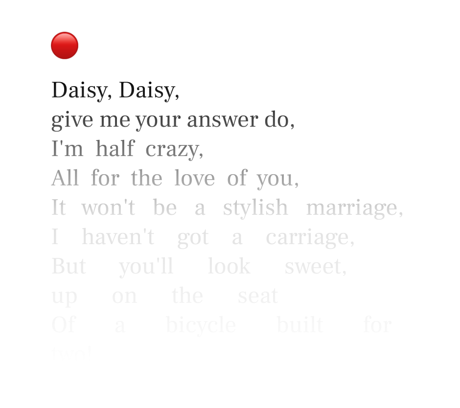
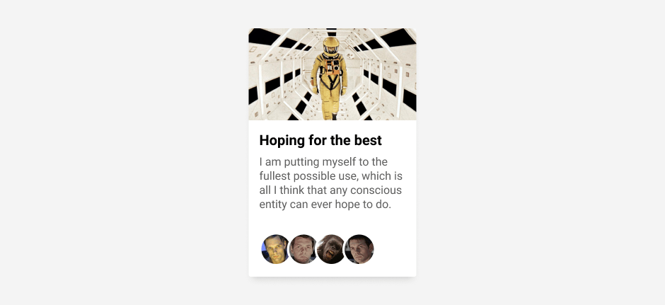
My God, it’s full of cards.
As commander Bowman clearly states, cards are everywhere today. Ahem, ahem… They are one of the most common items in the UX/UI designer’s palette. And why is that, you may wonder? Well, there are quite a few reasons for that.
First of all, they’re completely responsive on all screen sizes. It is easy to stack them in all directions. Their hierarchy structure is obvious. People know how to use them as soon as they see them. We usually place them in lists that easily enable screen readers to access the information.
So why do we still see them as a challenge when it comes to creating them?
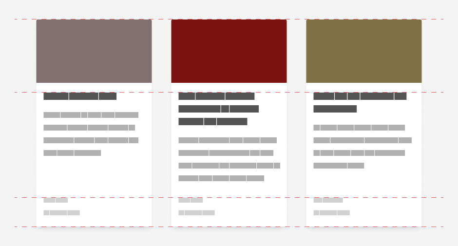
The most usual suspect is the amount of content we want to squeeze in there. And that is also our downfall. It’s much better to think in reverse, is there anything else that we could omit from the card? For instance, if many contributors wrote an article, should we put all of them on the card? What to do if the headline is just too long? Do we show an excerpt or not? How do we deal with drastic differences between lengths of two or three cards standing side by side? Answers to all these questions vary from project to project, from client to client, but here are some universal guidelines that could help you out.
UX and UI guide – how to design cards for the web
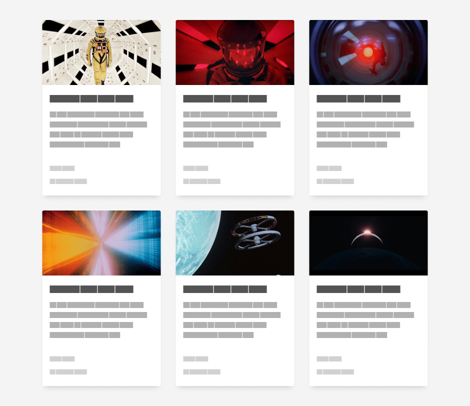
Images
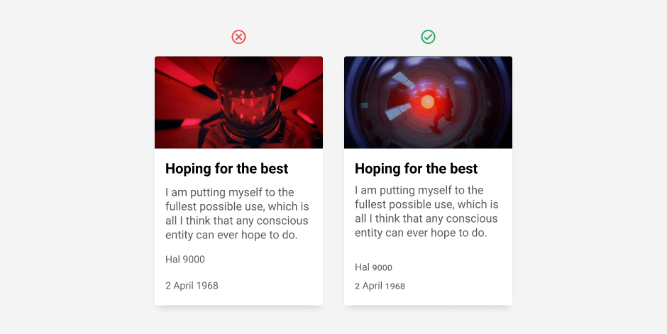
The image gives your card uniqueness among other cards, so it’s the best way of recognizing while fast skimming a page. True, every card could have a different headline as a differentiator, but that’s not as obvious as images while skimming. It also establishes a firm head of the card. Be sure to use an image with content clearly connected to the card’s subject – theme clarity should be the prime concern when choosing an image. Don’t hesitate to use a photo editing tool to enhance the theme and make it more prominent.
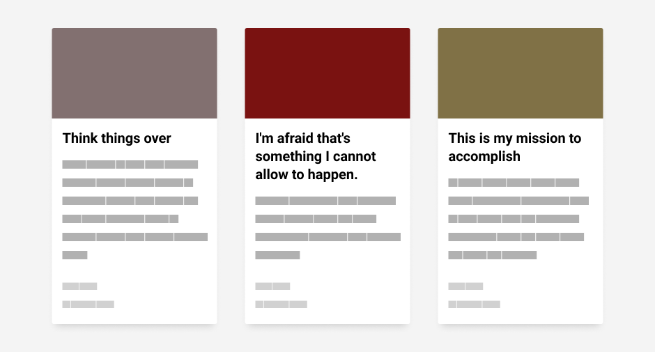
Headlines
Headlines should be short and concise, but often enough, that is not the case. Pick a well-designed but simple typeface to carry the message. Yes, you can pick from thousands of fonts. Should we use serif or sans serif? Bold or regular? What about this trendy one? But think about these first: who will use this page? Will it still be used in two, three years, and if yes, will that typeface still be popular as today, or will it look outdated or make you feel ashamed for selecting it in the first place?
Simplicity is always the best way forward, enabling longevity, resistance to unforeseen trends, and appreciation by most users. So choose wisely a typeface that makes your headlines legible and easy to read while focusing on an individual, single card; but also to catch the user’s eye while skimming effortlessly. Leave display typefaces for H1 and other prominent textual content, but cards should be kept simple. Good simple (some would say boring, but boring is sometimes good) choices will stand the test of time.
Note:
Sometimes we can find headline overlapping images. To make them more legible, designers are making transparent overlays or gradients below the letters. Well, sometimes that works, but on the card design, it is just wrong. While designing a card, more often than not, we can’t know how long those headlines will be. Also, we don’t see the content of the images because it’s obscured by text. Maybe the focus of the image is exactly where our text is. That’s awkward, isn’t it? If images are the most prominent part of the cards, they’ll be the first thing the user sees while skimming a page, so why hide it behind the headline, overlay, and/or gradient? The image would be more explicit, and the text would be more readable if kept separated.
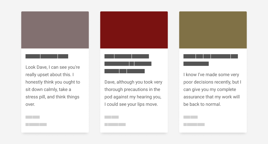
Excerpt
When users visit your page and see a couple of cards, it is our job as designers to make the content interesting and motivate users into accessing it and reading it. If an exciting image draws our attention, we’ll read the headline. If the headline grabs our attention, we’ll read a short and concise excerpt. And only then, if we’re still hooked, will we open and consume the content. So yes, the excerpt is a third and not the least important part of the card’s structure and hierarchy.
+As well as with headlines, or even more so, pay special care when choosing a typeface. This text is smaller, so the threat of poorly conveyed messages is far greater. There are occurrences where the excerpt isn’t that necessary, and these are when cards represent videos. So why do these cards sometimes don’t need an excerpt? Well, it is merely because of our general hastiness. It’s far more straightforward to start a video, skim through it with a tracking bar than to read an excerpt. Am I right, or am I right? 😉 Also, you can have a fast video preview on hover.
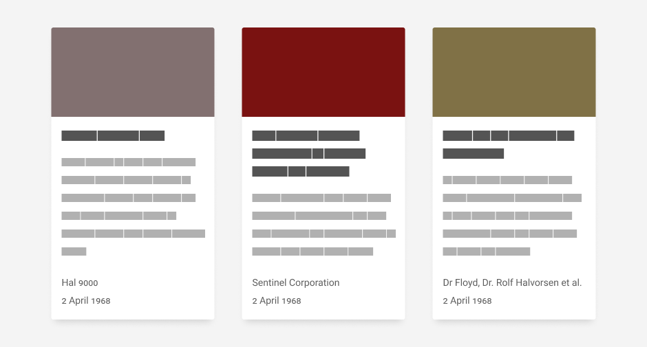
Authors and Dates
Attribution is an essential part of the article because it gives it credibility.
Don’t be tempted to show all authors and contributors regardless of what your clients say. A complete list of authors isn’t needed here. Of course, you’ll have them all neatly presented when users open your posts, but here, let’s keep it to a bare minimum – one to two primary authors. The rest of the authors can be neatly replaced with et al. – a phrase coming from the Latin language meaning “and others.”
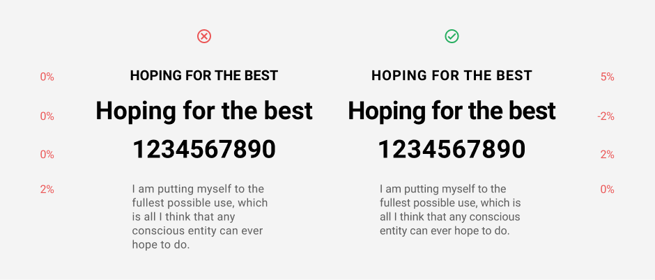
As for the dates, it is essential to define the date’s formatting and be concise throughout the project. Some countries set it as DD MM YYYY, some as YYYY MM DD, some as DD Month YYYY, etc. Some separate chunks with a forward slash, some with dots, and some with spaces. There is no good or wrong way, but try to figure out your target market and set your dates in their customary manner. Also, keep in mind that you should use uppercase numbers when standing alone (like in the image below), but if it’s part of the sentence, then the numerals should be set in small caps numerals to match the x-height of the letters. Your typography nerdy friend will love you even more – It’s more elegant and easier to read.
Links
The card is essentially a rich link to some content. Its purpose is to be a bridge from a list of items to a single item page, blog post, or some other type of content. Link is used for a long time, so this is obvious, but what exactly should be a link in the card? The headline in the card or the image? Or both? Or even the whole card itself? It seems kind of obvious that the entire card is a link. Or is it?
Again it depends on the content. Imagine using cards to present blog posts on your home page. Each card links to a single blog post. But usually, we separate blogs into various categories and/or mark them with specific tags. These make your post easier to find in the collection.
So, to fully utilize these categories, as well as tags, maybe they could also be a part of the card. If a whole card is a link to the blog post, the user will be stripped of the ability to click on a category and get a broader picture before reading your blog post. In that case, dividing two separate links is a good option. One should be a headline, and the other a category or a tag. Or even the author’s name could be a category. Clicking on it could lead to a separate post listing. Just take care of those foci and hover states.
But it’s not as simple as that. If, for whatever reason, you rely on a tab and keyboard to navigate your web content and not your mouse, you’ll notice that it could be a daunting task navigating through all those <a> elements because the screen reader must read them all one at a time. So, for the sake of accessibility, you should avoid multiple links in one card. We can easily access all that content (tags, categories, etc.) from the linked page instead.
And just when you think that’s all… Oh, no. Think about this one more possibility. What if the card contains a button? These are often called CTA (short for Call To Action). If there is a button whose prime purpose is to draw attention to a specific action, it should overrule other clickable areas and be the card’s primary action.
Visual tweaks
You can tweak your card to make it more exciting and balanced or stand out more from thousands of other similar cards.
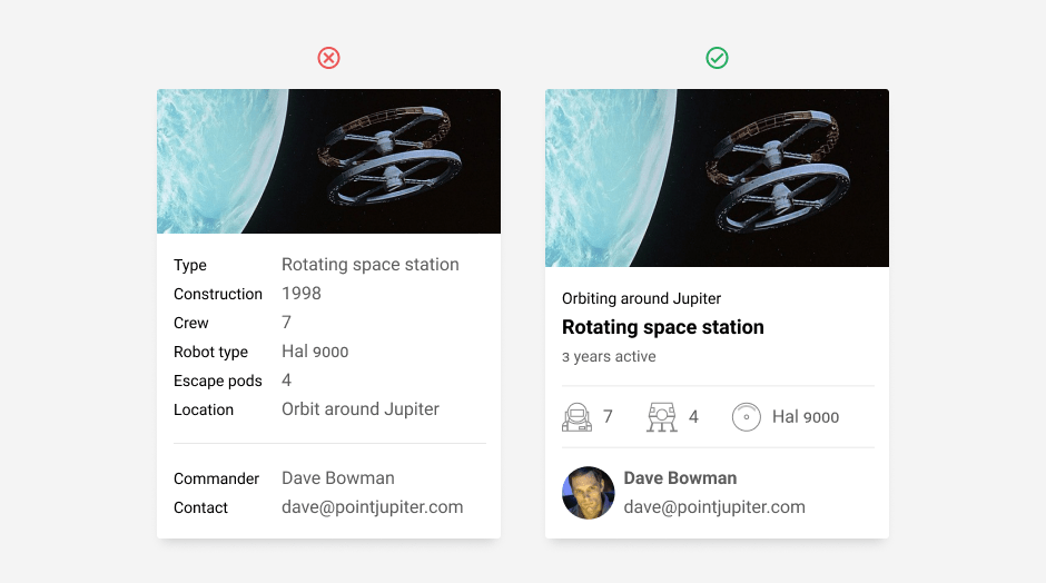
Database content
Is your card supposed to present content from a database table? Looking at it could be a daunting and boring task. Try to think outside of the database and present information in a more useful, more human way.
Box shadow
Box shadow below your card gives your card additional dimension. But don’t make the shadow an all-around halo. It’s much better looking and far more natural with an offset. Keep the same imaginary light source consistent throughout your whole project. It doesn’t look good if one item has a shadow below and the other to the right. When picking a color for your shadow, it’s always better and more natural to choose a color with a darker hue of the background, not just black with transparency. You could also achieve this by giving your black shadow an overlay blend mode, but at the moment of typing this blog post, that can’t be reproduced easily with CSS. This effect also doesn’t work if you export png with a transparent background.
Note:
To make shadows even more good-looking, try to give them a negative spread in Figma or play with a vector curve in Photoshop layer style. Those shadows will look more natural and modern. Check it with your developers – it’s easy to achieve it with CSS. Oh, and additional note if you’re trying to make it in Figma. It won’t work unless you check the “clip content” option on the frame and give it a fill color.
Multiple avatars
Does your card have images of authors instead of names, and they’re stacked all together? Try and overlap them slightly to make them feel more compact and connected. If images are from different sources, they are probably out of tune with each other, so dividing them with an outline that matches background color is a great way to make them intertwine and work well together.
Chart
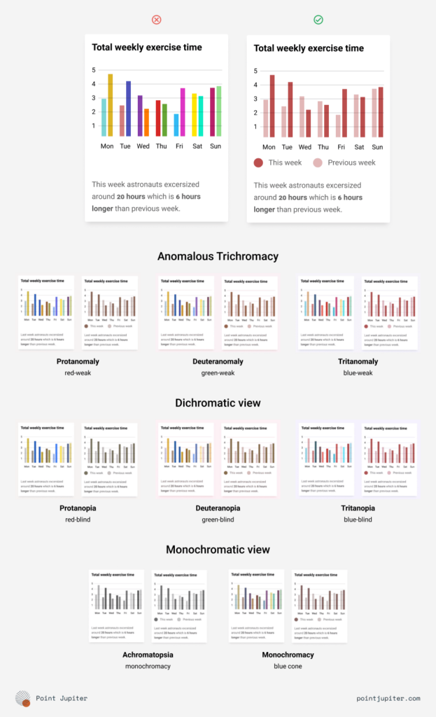
Is your card supposed to present a chart? Yes, why not. Just remember that you can’t squeeze just about everything in a small amount of space. Make it legible and appealing to the eye. Too small text is unreadable and doesn’t serve any purpose. The client will give you their brand book in which someone designed charts ten + years ago where all charts are in different colors. Well, that may seem like a good idea at first, but what about accessibility?
Some people aren’t able to differentiate colors from one another. So it’s better to use different hues of the same color. (Check the image below.) Just remember to keep them well contrasted. Setting them all with different hues of the same tint will also look more like a part of the brand system. The downside in this is you can’t have too many different shades and still differentiate them. But as I said before, charts with too much data aren’t legible, so this is an improvement, isn’t it?
Letter spacing
To make various parts of the card equally legible and keep the same balance between them, you should pay special care to the often forgotten typography feat, and that one is letter spacing. For instance, you could have a big headline, a string of numbers, uppercase letters, lowercase letters, etc. All of these are better with different letter spacing. For example, a big headline works much better if its letters are densely spaced. The string of numbers, irrelevant if it consists of uppercase or lowercase numerals, should have a little more space between them. Uppercase letters should have the same spacing treatment as strings of numbers. As for lowercase letters, don’t be tempted and try to tweak their letter spacing. Sometimes, if you’re using well-designed typography, these are already well-spaced, so it’s better to keep them as the type designer intended.
Element spacing
More often than not, we come across uniformly spaced elements – all the distances are the same. In most occurrences, it’s just bad organization. Let me explain this. If you have a card with four elements, headline, excerpt, author, and publishing date, would you evenly space them to make the card tidier? You would, would you? Look at these elements with the atomic design principle in mind. Let me explain. Atomic design principle tells us that any web structure elements go from the basic to the more complex element in the following order: atom, molecule, organism, template, page.
Remember headline, excerpt, author, and publishing date? These are all atoms. They are part of molecules that combine into an organism called the card. The first molecule is made of two atoms – headline and excerpt – the second one of another two atoms – author’s name and published date. Together with the image on top, they make the organism, the card. So to make their association clear, we should space them accordingly. Space between atoms headline and excerpt inside the first molecule will be smaller than the space between this molecule and the next one, which contains other atoms – the author’s name and published date. To make this as clear as possible, space between atoms should be smaller than the space between molecules. Spacing like this will give your content more structure and order.
Note:
I’m not telling you that you should over exaggerate spacing between elements to make groups visible. We can achieve this with only a few extra pixels, so be painstakingly meticulous with it. But if you still feel your spacing is too tight, try and play with element sizes and colors. Maybe we could set the author’s name and publishing date in slightly lighter colors than your headline and excerpt. These differences will augment your card’s structure and create a clearer hierarchy.
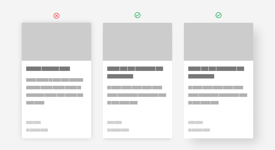
Card height
If you have two or more cards in a row, it is neat to keep them aligned and balanced. Frequently, this alignment is hard to achieve because of the differences in content, but with some compromises, it is manageable. If you keep content in a specific order, it is possible to set whitespace to stretch and keep the cards as neatly as possible. To determine the most appropriate whitespace, it’s best to look at which part of the content varies the most in height. And usually, these are headlines and excerpts.
Choosing to stretch space below them seems the most logical. You’d end up with an image, a headline with or without an excerpt, gap, author’s name, and publication date. If your next card in a row follows that same principle, you’ll have uniformly tall cards with more or less whitespace below its main content and bottom. Since we read from top to bottom, we’ll have content neatly stacked downwards, while author and date will make a solid foundation and thus keep the balance. Of course, not every row must have the same height. The height of a row is determined by the highest card, while others we can adapt accordingly. Be kind to your frontend developer, and you can count on them to make it happen. 😉
Bonus
While working on one of our recent projects for a client, we were supposed to design a set of cards containing a headline of undefined length. Some will have excerpts, and some won’t. Most will have an image, and few won’t have anything except textual content, 99 percent will be vertical, but others will be horizontal, etc. Lots of variations, and they all should fill as a part of the same system.
To tackle this, we chose to work with Figma. Its Auto-layout is one of the best tools in recent years, and I strongly recommend giving it a chance if you haven’t already. The trick is to work your way through content as your developer would, “group” particular elements in logical organizations, and align them accordingly. Let’s break this up – it’ll be more precise.
Usus est magister optimus
(from Latin: practice is the best teacher)
Let’s say your card has an image, headline, excerpt, author’s name, and publishing date. The whole card would have a vertical auto layout with the “spaced between” option enabled. Then image, headline, and excerpt would have their separate vertical auto layout with a specific distance between them. And finally, the headline and excerpt would also have a vertical auto layout with the distance between them smaller than between the image and headline. At the bottom, the author’s name and publishing date would be in their vertical auto layout with a shorter distance between them according to their size. Framing them like this would result in two parts of the content – upper and lower – and they would be aligned to top or bottom while the space between them would stretch.
Now duplicate your card a few times, so you have three cards in a row. Change headlines and excerpts, so you have different lengths of content. Put the three cards in a horizontal auto layout. Align them to the top and give enough margin space between them. Now select all three of them and change their height to “fill container” and voilà. You now have three cards with different lengths of content, all neat and balanced. You’re welcome.
Figma file: https://www.figma.com/file/u0zwuHHw2i5KKH5s91Ah2e/Cards?node-id=0%3A1
Let’s connect
If you are looking to join a great team, head on to our Careers page and apply. We will help you grow your development and engineering skills as well as your soft skills. And you can count on us mentoring you and supporting your growth.
If you are a potential client interested in hiring us, we should talk! We’d love to hear from you and learn how we can contribute to your success. Check out our work and cases and learn more about the services Point Jupiter offers.
Followup
This article discussed the basic elements of the card organism. We touched little on accessibility, but that’s a whole new ball game, and I’m looking forward to writing about it in the future.
Thank you.